Contrast Color Scheme For Rigid Box Packaging Designs
Selecting a suitable contrast color scheme for your rigid boxes offers you multiple benefits. The best of them is that it helps elevate the product impression and make it more noticeable and memorable in the target market. We will suggest some unique contrasting color schemes for your boxes. Feel free to choose one of them that best suits your product. Choose something that can reshape your brand identity in the market. Remember the overall brand theme and the message you want to portray to get the best possible results. Read this blog to gather some stunning color schemes for rigid box packaging designs.


Wow! Look at this amazing box packaging design! Do you ever exchange such comments with your pals? If yes, you might know how important the beauty of a box is in the world of product selling/marketing/business. Remember an event when you last time got impressed by the packaging of a certain product? You can make a list of what excited you the most. Let me guess! It might be the colors that you mention at the top of your list. Not a big surprise, we admit colors are as important for all of us.
The neuropsychology of colors explains that these hues or pigments on your boxes can draw the customer’s attention. They ignite special moods and emotions in the customers and slowly appeal to them to decide on their choices. So, it is vital to use correct color schemes to make your box an open invitation for your clients.
If you got lost in deciding the best color model for your product boxes, especially rigid boxes, you must give this article a read. Here, in this post, we will dish out some eye-catching color schemes for rigid setup boxes.
Different Color Scheme Choices for Your Rigid Boxes:

The addition of contrasting color schemes into the design of rigid boxes is a strategic approach to set your brand apart. Marketing experts have long studied the impact of colorful packages on potential clients' moods, behavior, and emotions. The findings from such studies and research have allowed the brands to use specific principles of color psychology and influence people's buying decisions. Therefore, selecting contrasting colors for your rigid packages needs serious thought. After all, they assist the target audience in relating or associating particular product packaging design resonating with your brand values. Giving the contemporary color selection for packaging a thought is also worth considering. Here is a highlight of various contrasting color combinations for boxes and their role in making your product stand out. Read it out to collect more box design ideas.
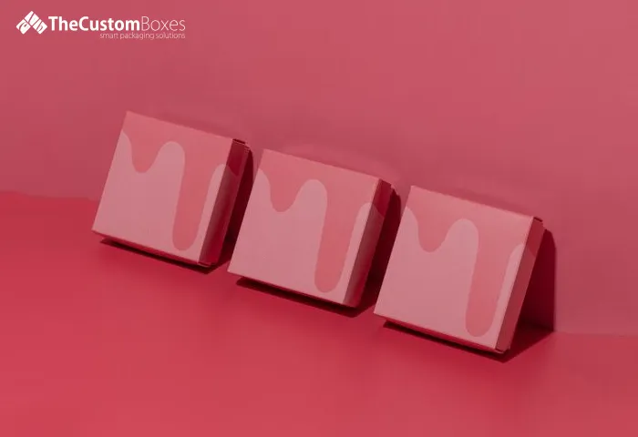
Pink And Raisin Rigid Boxes:

You can spark with the hues of pink- known for its soft and elegant rigid box packaging looks. The mixture of bright pink and raisin creates a perfect high contrast in the design of luxury rigid boxes. Such packages give a bold, dynamic, and energetic look that demarcates and distinguishes your products from other available options. You can select a lighter shade of pink while still creating a contrast in the packaging design. Lighter or softer shades of pink, along with raisins, usually work best when you provide products specifically for females. Likewise, the darker shades of pink with raisins signify strength and sophistication. However, the addition of shades of raisin color allows you to wrap even the watches and other products for males as well. So, before deciding between the lighter and bolder shades of pink and raisin, determine your target audience first. This will allow you to appeal to people's emotions in a better and more comprehensive way.


Shades Of Pink And Brown:
You can also use the softness of pink color paired with the boldness of brown in your packaging design boxes. Pink is sedative, soothing, and non-threatening. It signifies sympathy, sincerity, beauty, and, most importantly, luxury. The use of different shades of pink in the design of custom rigid boxes creates more motion and depth. However, mixing up shades of pink with dark brown in the packaging design adds an important level of contrast. Above all, it creates a sense of luxury in the minds of the captive audience. So, associating your products with luxurious and premium vibes is no problem when you use this contrasting color scheme in the box design. This color combination also proves instrumental in making your brand a center of attention in the marketplace by highlighting the parent brand theme on custom rigid box packaging.
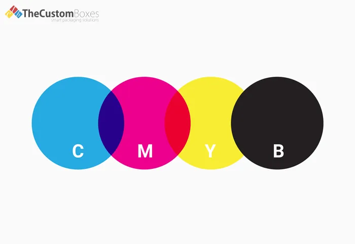
These four ink colors are mainly used when deciding on the overall rigid box design. Their combination gives your box the exclusive look that you want or desire. When used separately, they produce a color scheme that is sleek, modern, bright, and full of life. However, when you mix them, you may create any color that associates well with your products and speaks your brand language. So, use a mixture of these specific hues in your box design and give your items the contemporary look they deserve. Always remember the principle of minimalism while combining different shades. Otherwise, you may produce a color blend that does not align well with your brand goals and overall theme.
Gold, Charcoal, And Grey:

This perfect combination of contrasting colors makes your product packaging design shine more on the retail shelves. When the customers are exploring the shelves, they are usually looking for the items that catch their attention immediately. This contrasting color scheme works perfectly in grabbing the undivided attention of the target audience. It also gives a perfect highlight to the details printed on the luxury packaging. The gold hue signifies nature and joyfulness. When combined with two different shades of grey and black, a layer of maturity and seriousness is added to the design. This relays a message that your retail items would last long and are worthy of a buy.
Black And White Rigid Boxes:

Sticking to only two colors in your packaging design may not seem a good idea at first. But as far as the black and white color combination is concerned, it does not seem boring to the target audience. The cheerfulness these two hues bring into the design of custom boxes is impossible to ignore for potential clients. They give a premium vibe to rigid boxes wholesale while still maintaining a minimalist look throughout the product packaging. More importantly, they send a message that your items align well with the current needs of potential clients. Customers tend to associate this color scheme with premium and luxury brands. They are also ready to pay even more for your products.
Final Thought:
Whether you like the contemporary colors for your packaging or find the contrast of black and white most fascinating, select the appropriate color model. We as one of the renowned rigid box manufacturers offer our esteemed clients CMYK or RGB color models. If you find any problem in selecting a color model for your boxes, feel free to dial our toll-free numbers (1-800-369-1840). Reach us now and choose an incredible color scheme, especially contrast color schemes for your rigid packaging.
Premier American Manufacturer of Packaging and Custom Boxes
Experience the ease of creating and ordering custom boxes and affordable packaging online with the Custom Boxes. Contact us today to discover how we can turn your packaging vision into a reality.

Payment & Security
![]() No Hidden Charges
No Hidden Charges
![]() Money Back Guarantee
Money Back Guarantee
thecustomboxes.com online guarantee the privacy of all the customers and never share their personal information with third parties. For more details read our Privacy Policy.


you might also like


-And-Retail-Ready-Packaging-(RRP)-A-Complete-Guide.webp)
